Display graphs for chart of accounts
A graph can be obtained for a set of accounts from the main window. For a particular account, you can display the graph directly in the account master record, open for editing.
Graph from an account record
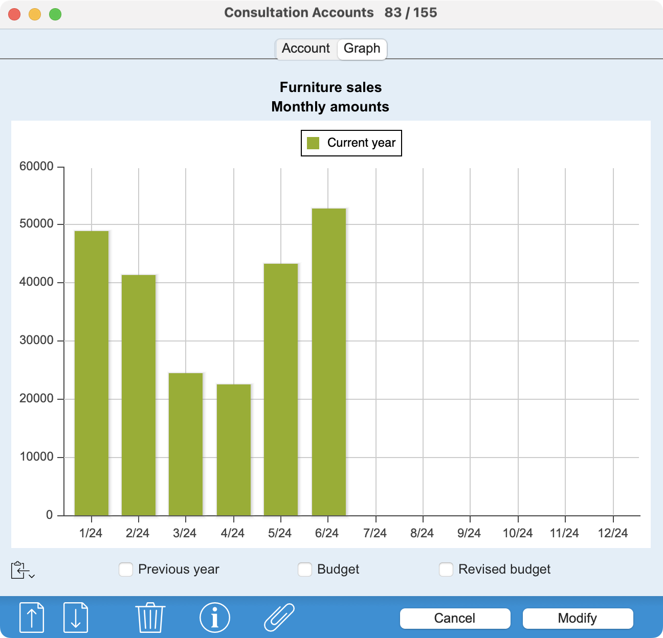 |
When you open an account record under modification, clicking on the Graph tab displays a graphical representation of the account balance evolution. For totalizing accounts, the program calculates the sum of accounts beginning with the same digits (e.g. 1010, 1020, 10499 for a totalizing account 10), which does not necessarily correspond to the hierarchical nesting of accounts. The value of the Index field is also ignored. In the PRO version, checkboxes at the bottom of the graph display values from the Previous year, the Budget or the Revised Budget for comparison.
|
Graph for several accounts
From the main window, the Graph button at the bottom of the screen generates a graph for all selected or activated accounts (minimum 2, maximum 50).
The buttons at the bottom of the window offer different display modes (columns, curves, bars, sectors and areas). Depending on the context, some display modes may not be available.
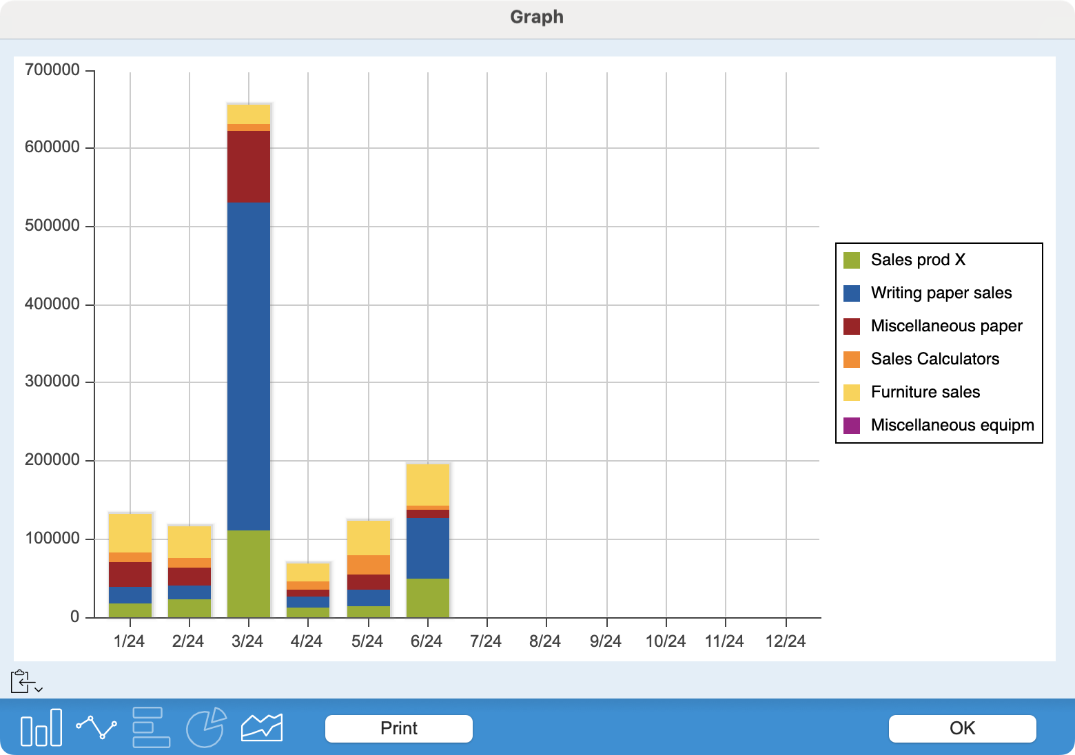 |
It's up to you to create a coherent set of accounts to generate the graph. If, for example, the values represented include a totalizing account and accounts totalized by this totalizer, the graph may be represented correctly as curves, but not as columns or bars. This will also be the case if you request a chart for a set containing both sales and purchase accounts.
|
For totalizing accounts, the program calculates the sum of accounts beginning with the same digits (e.g. 1010, 1020, 10499 for a totalizing account 10), which does not necessarily correspond to the hierarchical nesting of accounts. The value of the Index field is also ignored.
Comparison of values, monthly trend
In Light and Standard versions, a checkbox below the graph displays the previous year's values for comparison.
In the PRO version, the graph display is preceded by a dialog in which you can check the Monthly box. In this case, you'll get a graph with the months on the abscissa, and therefore a representation of the evolution of account balances for a period that you can define using the local menus. The other checkboxes allow you to display, for comparison, the values of the Previous Year, Budget or Revised Budget.
Copy or save the graph
The on-screen graph can be copied to the clipboard, or saved as a file on disk, for insertion in another document, such as an activity report.
You can specify the image format in which you wish to retrieve the graph. To do this, use the small button on the left below the graph. A long or right click brings up a pop-up menu with a choice of PNG, JPEG or SVG formats, or the Save… command.
Print the graph
Simply click on the Print button at the bottom of the window. Once in the print dialog, you can also request the creation of a PDF file rather than a paper printout.
 Français
 Deutsch
 Italiano